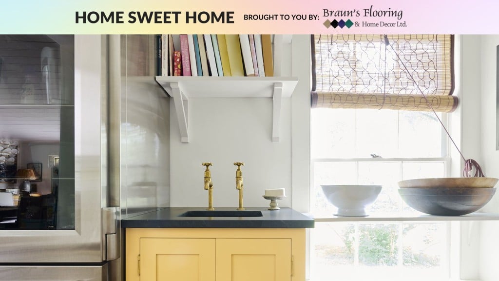
When you’re looking to revamp and refurbish your home, turn to the professional team at Braun’s Flooring & Home Decor Ltd. Quality products for all your home renovation needs!
Sponsored Sponsored content Choosing Colours for Your Home
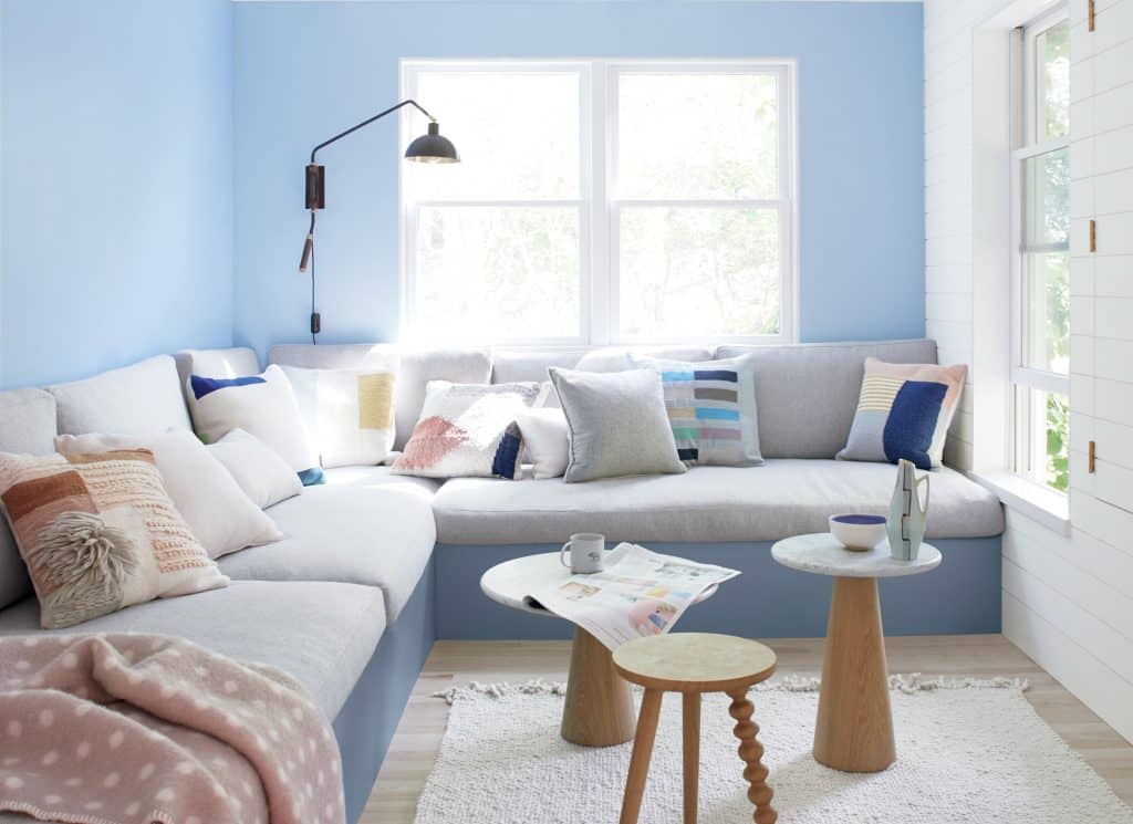
Choosing colours for your home that look good together can be intimidating, especially when moving into a new space or updating an old one.
Choosing colours for your home that look good together can be intimidating, especially when moving into a new space or updating an old one. Before heading into project mode, consider these tips for mastering colour coordination at home from Sharon Grech, Benjamin Moore colour and design expert.
What’s Staying and What’s Going?
The simplest place to start is to look at what’s already in the room. Pick one item as an opportunity to bring a refreshed, colour-coordinated feel to your whole space. Do your floors need a little love? Is your furniture looking tired? Do your window trims seem faded? Base your design and colour ideas around the main colour in a room and pair colours accordingly.
Local News Straight
to Your Phone
Download our app today!
Available on Android and iOS devices
It’s All About Balance
The simplest way to create a balanced colour palette is to follow the 60/30/10 rule: 60 percent of the room should be a dominant colour, 30 percent should be the secondary colour and the last 10 percent can be an accent colour. These colours are referred to as mass colours, and the easiest way to harmonize them is by selecting a consistent undertone; either warm or cool.
Warm undertones are typically orange, yellow or red, while cool undertones are green, blue or purple. Grech says, “It’s safer to stay consistent with undertones, but when painting exclusively with a colour like white, mixing and matching warm and cool undertones can add subtle distinction within a space.”
What’s Old Can Be New
Latest Stories
Now that you’ve established what to re-vamp, Grech reminds us that paint is not only for walls.
“Give furniture a second life with a fresh coat of paint and opt for a colour that complements the tones found on your walls and flooring.” For this, she uses Benjamin Moore Advance paint, an easy-to-apply paint that makes old furniture look new again. “Pair dark walls with furniture in cool tones and lighter hues such as fresh Smoky Green CC-700. Or, if you’re using a white wall, mix in a cozy, warm pop of colour, like Stuart Gold HC-10.”
Promote Wellness
In today’s fast-paced world, creating a space that promotes your well-being is essential. From a skincare vanity to a dedicated fitness area, make your home your sanctuary and reserve an area for self-care and peace. Choose paint colours that calm the mind – such as Benjamin Moore Palest Pistachio 2122-60, a barely-there hue with crisp notes of blue and grey, or Benjamin Moore Natural Linen CC-90, a sandy neutral with just the right amount of rustic warmth and elegance.
Stay connected with local news
Make us your
home page

When you’re looking to revamp and refurbish your home, turn to the professional team at Braun’s Flooring & Home Decor Ltd. Quality products for all your home renovation needs! Benjamin Moore Paint Dealer. The perfect stop for all you DIYers, contractors and anyone looking to improve the look of their home. Ask our experts for the best home reno advice, we’re here to help.
Authors

Related Articles
Sponsored Sponsored content Clearing Snow Around Your Home? Don’t Forget These Areas
When clearing snow this winter, here are some common – and other less common – spots you should always get around to.

Sponsored Sponsored content Easy Home Improvements You Can Do in Winter
Here are some low-cost tasks you can tackle that will help improve your home’s energy efficiency and maybe even save your life.
Sponsored Sponsored content Winterize Your Cottage
Here are some tips to winterize your cottage that will protect it from the weather, keep critters out, and more.